Some links to products and partners on this website will earn an affiliate commission.
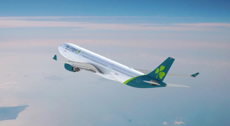
British Airways’ IAG stablemate, Aer Lingus, has just revealed their new livery.
What do you reckon?
I wasn’t intending to include the marketing babble in this post, but the stuff about the shamrock is really too good not to share:
“We have restyled the shamrock to represent the values and future of Aer Lingus – our modernity, confidence, optimism and strength.
The tilt symbolises our dynamism and speed. The stem keeps the shamrock recognisable and strong. And the heart-shaped leaves reflect the warmth and hospitality of our brand.
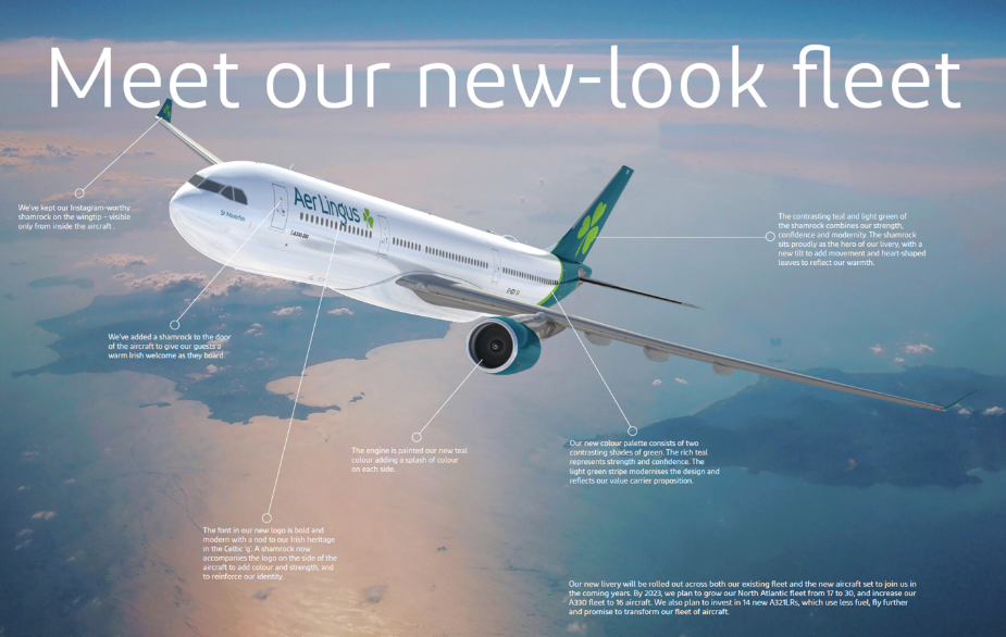
You’ll see four shamrocks on the new livery. The first is within our new logo, the second sits on the tail fin, a third welcomes guests at the door, and a final surprise awaits on the wingtip.
As our new look takes off in 2019, the shamrock will continue to fly high as the hero of Aer Lingus.”
I genuinely wonder if whoever wrote that managed to pitch it with a straight face? 🙂
If you’re a sucker for detail (or just want to enjoy some more glorious marketing nonsense), here you go:
- Aircraft Doors –We’ve added a shamrock to the door of the aircraft to give our guests a warm Irish welcome as they board.
- Brand mark – The font in our new logo is bold and modern with a nod to our Irish heritage in the Celtic ‘g’. A shamrock now accompanies the logo on the side of the aircraft to add colour and strength, and to reinforce our identity.”
- Engines – The engine is painted our new teal colour to bring colour to the aircraft.
- Winglets – We’ve kept our Instagram-worthy shamrock on the wingtip – visible only from inside the aircraft.
- Swoosh- Our new colour palette consists of two contrasting shades of green. The rich teal represents strength and confidence. The light green stripe modernises the design and reflects our value carrier proposition.
- Tailfin – The contrasting teal and light green of the shamrock combines our strength, confidence and modernity. The shamrock sits proudly as the hero of our livery, with a new tilt to add movement and heart-shaped leaves to reflect our warmth.
Bottom line
The old green livery was definitely a little dated, but it stood out and I actually rather liked it. On the plus side, the new livery looks fine and at least Aer Lingus isn’t (yet) claiming to be a rooftop bar.
Do you like the new livery? Are you “strong and confident”… like teal?

Leave a Reply