Some links to products and partners on this website will earn an affiliate commission.
Many people often don’t realise their reliance on Google products… until they find themselves behind the great firewall of China! Recently I found myself using Skyscanner is an attempt to search for flights, but desperately missing one of Google Flights most interesting features.
But once I returned to Europe, I noticed that Google Flights has made a really annoying change and I wish I knew how to fix it…
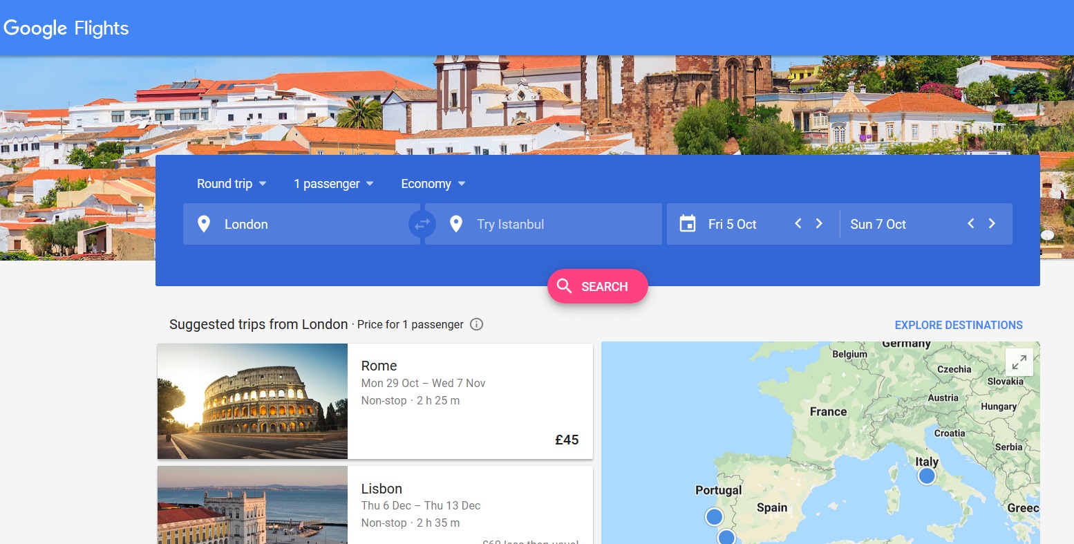
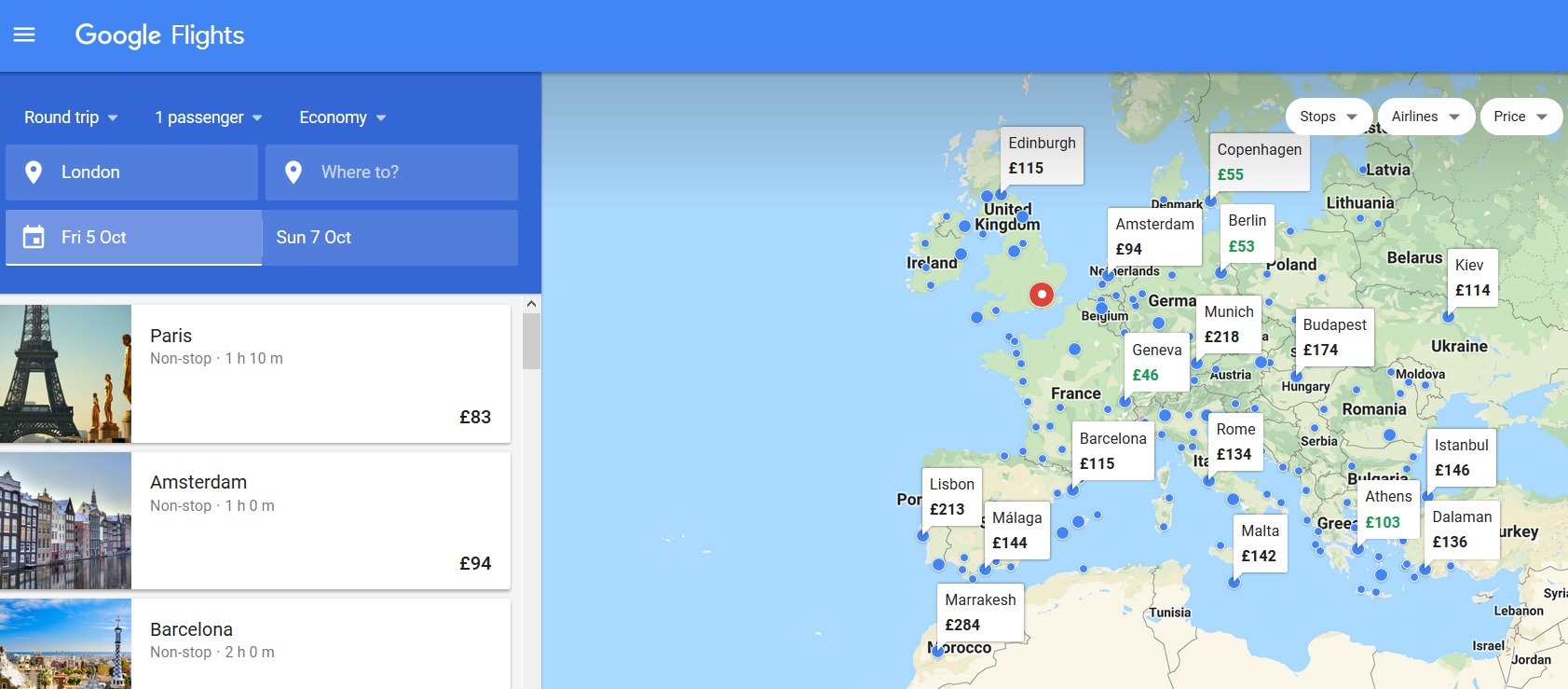
One of my features I rely upon is something I like to call “I don’t care where I fly, I just know when I want to get away…” Here’s what it should look like on Google Flights.

What I want to see is this… a visual representation of which cities are possibilities for a weekend getaway on 5-7 October… I can delve deeper by choosing to only see flights from Star Alliance or Oneworld airlines, non-stops only, or to limit the flight times to afternoon flights only.

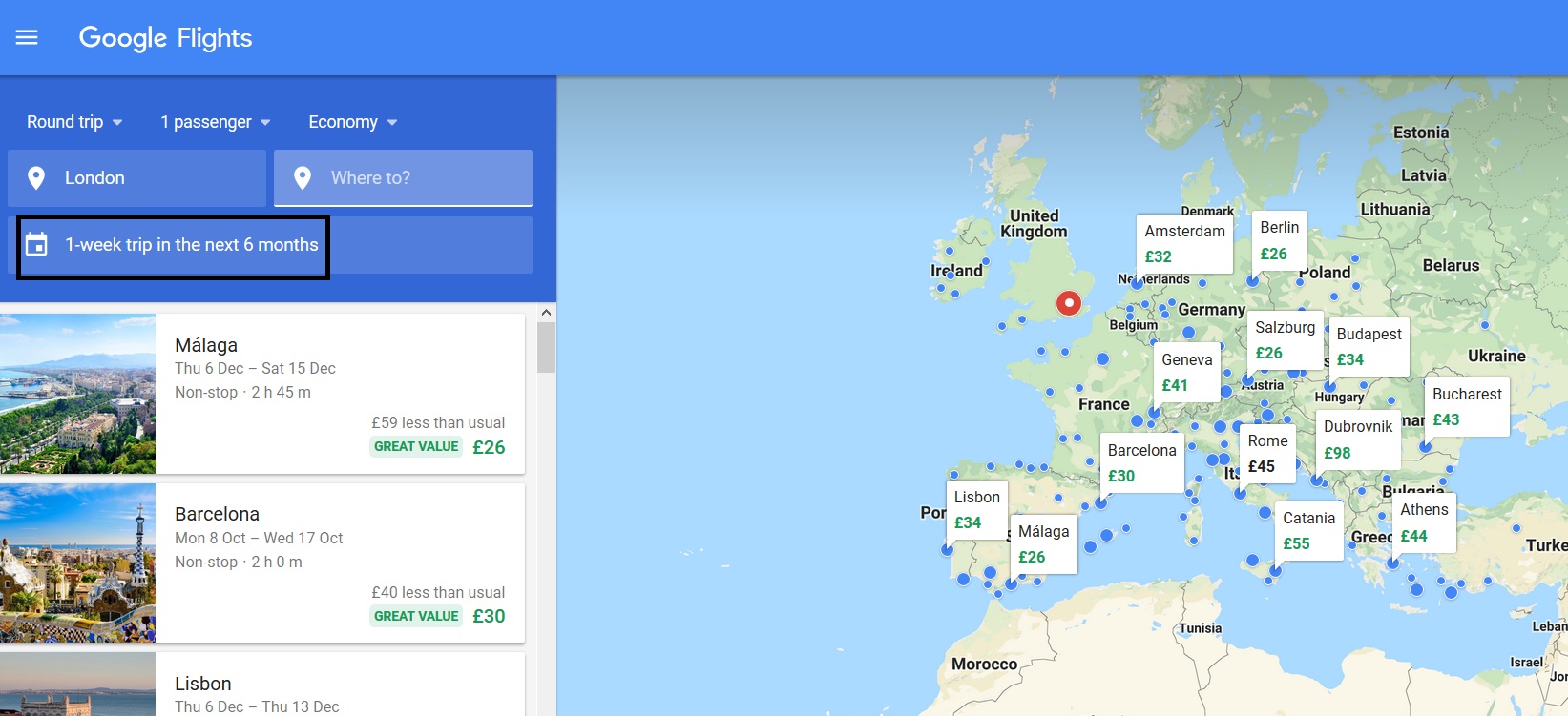
Instead… when I click on the search button in stage 1, I automatically default to this…

That’s all well and good Google – flights look really cheap. But I didn’t ask for “1 week trip over the next 6 months”, I asked for a weekend trip on specific dates! 🙁
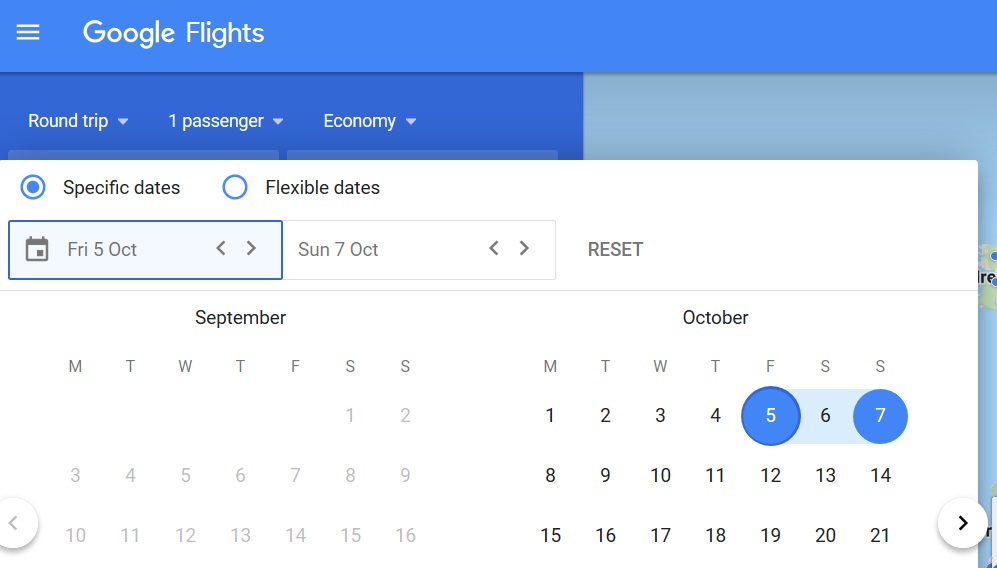
As a result, I need to click on the date field and change my search to “specific dates”, which is where I started off!

Apart from the opportunity to rant briefly, I thought that it would be worthwhile to highlight this change to readers who might also rely on Google Flights for inspiration about where, not when, to go travelling! Or even better… perhaps a reader knows how to fix these default settings!


I discovered this enhancement at the beginning of last week. In a rush, I continued to the BA site and was putting in the 3 digits of my stored card before I realised the date was wrong – Google Flights had given me the best price for the next 6 months.
So I’m not alone then! I booked the outgoing leg of a trip, since I could easily see dozens of useful cheap flights to continue onwards, but then I realised that everything on my required date(s) was going to be rather more expensive. 🙁
they’ve continually been making it worse – just like all these other software companies. now i need to be told what the ESC button does, just because other people are too thick. now, when i search for flights i have to click an extra three or four buttons. it’s got silly x’s for removing things and when i enter the dates i have to confirm after the second date ‘done’. really? the people who’ve ‘developed’ this software over the past few years are so thick.