Some links to products and partners on this website will earn an affiliate commission.
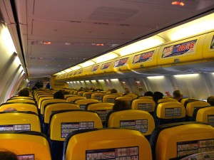
The migraine-inducing interior of a Ryanair plane is perhaps one of the most traumatic elements of what can often be a fairly challenging travel experience. Garish yellow interiors, adverts for phonecards thrust at you and barely any legroom.
But in March 2015, there came good news! Ryanair announced on its 30th birthday that, as part of its “Always Getting Better” campaign, it would be introducing a much-improved interior to its fleet of Boeing 737s.
In this campaign, Ryanair identified 18 improvement points to increase customer satisfaction (or “piss people off less”, to paraphrase CEO Michael O’Leary): including a better website, a second piece of hand luggage at no extra cost and new seats with more legroom.
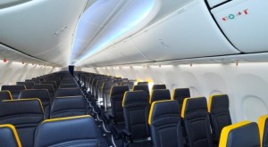
In early January, Ryanair posted a picture of the new interior on its Twitter account :
Passengers will be able to experience the improved interiors when Ryanair takes its next delivery of Boeing 737-800 aircraft delivery this month.
And bear in mind, when looking at the above, just how horrific the current interiors are:
Where does the extra legroom come from? Less seats?
The extra legroom will, we are promised, be there, but it won’t be through the instrouduction of less seats. Rather, the seats that are there will be “slimline”, which will create more legroom with the same number of seats.
We are also promised that the new interiors will feature improved LED lighting, larger window reveals and new overhead lockers, with more headroom.
(A version of this article originally appeared on www.insideflyer.nl, authored by Jan)


Leave a Reply